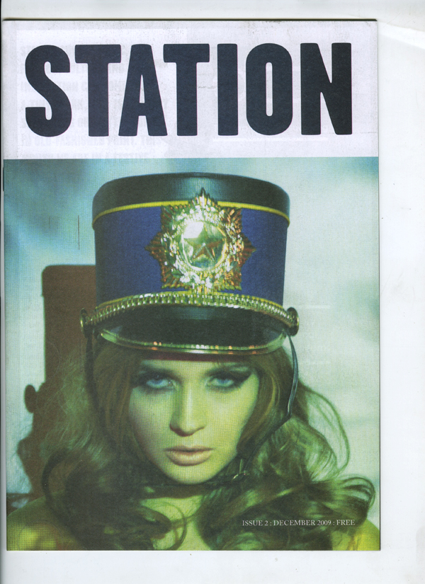
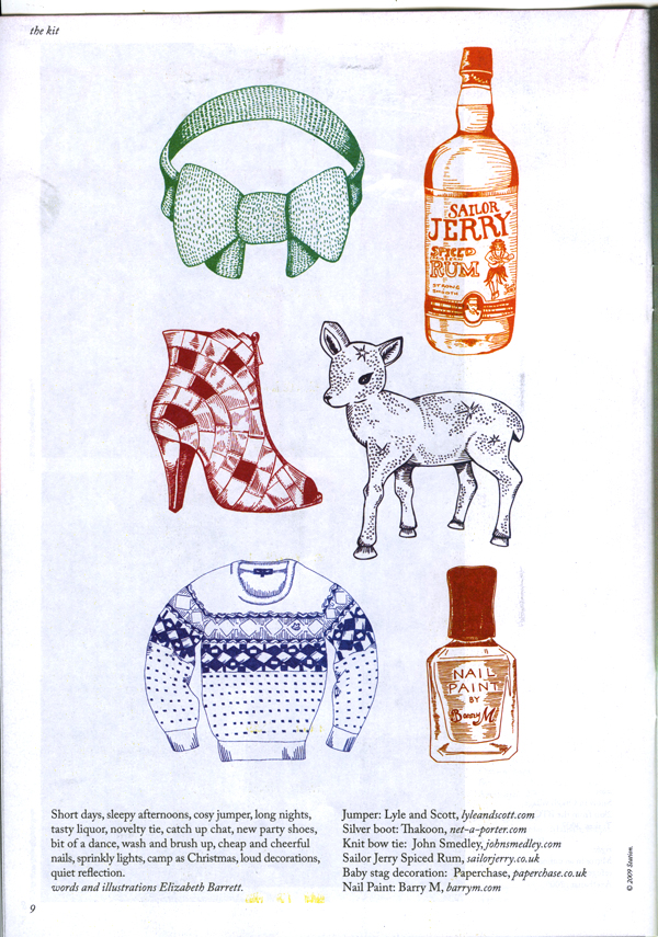
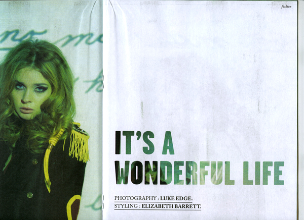
Picked this up free in a newsagents in Shoreditch- was really struck at how good it was- I particularly like the illustrated fashion/object page- can't afford the 'in' things- don't worry just draw them- and also really liked the projecting onto the fashion model- lovely stuff. The people involved can be found here........ & here........
Type Experiment
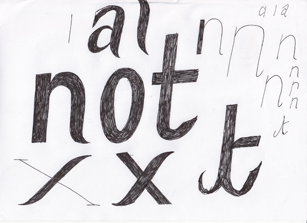
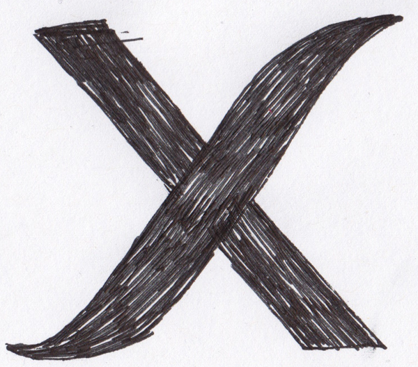
Long Ol Type
I noticed something recently- maybe it's been around maybe it's always been around but more type these days has been brought to my attention that is kind long. Example:

This excellent show catalogue/teaser/book/I'm not sure from Lincoln School of Art and Design Graphic Designers- (website's not the same really but hunt down the designers and check out their sites too- good stuff)- seriously ace work in here- it's less like a catalogue more a picture essay about anticipation- come round to my house and I'll show you. Really very good.
 This flyer for Field Day held in Victoria Park- simple and really striking.
 and this really nice magazine from Queen Mary's in Mile End. Uses some very nice clean type over image (which i'm also preparing a post on at some point) It is pretty nicely done all over but the cover is a real beaut if you ask me. It's also worth pointing out that all of these examples are printed on uncoated stock with no varnish or owt.
I guess 'long' type isn't a very good description I suppose condensed or something better describes it- but it seems to be about a lot and I really like it, quite understate, simple and often letting the context or other content help it out. There's this really tasty font just released from Hoefler & Frere-Jones, it's called Tungsten:
-Is that how you treat your friends? -He wouldn't have cared.
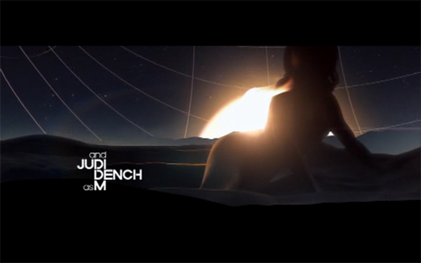 (amazing title sequence by MK12 for Quantum of Solace)
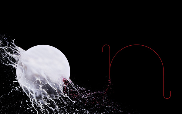
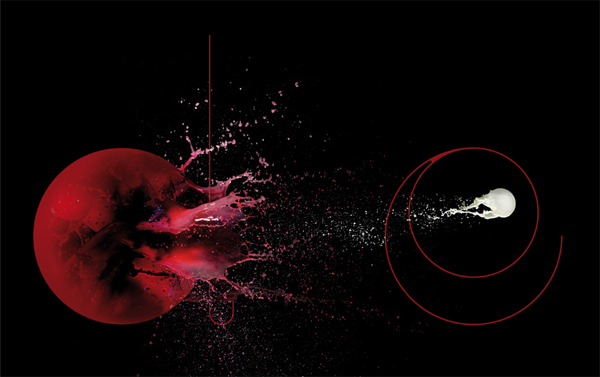
Non-Format
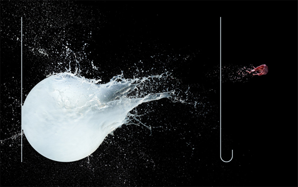
I love these guys and they've updated a few times and it's slipped under my radar. Just thought I'd share how insanely beautiful and stylish non-formats work is. Soon to be UK based no more- one half in Minneapolis and the other in Oslo- makes me a little sad somehow- still they keep making amazing work and I just hope one day I can create something with a fraction of the craft and awesomeness that they do. Link: Non-Format
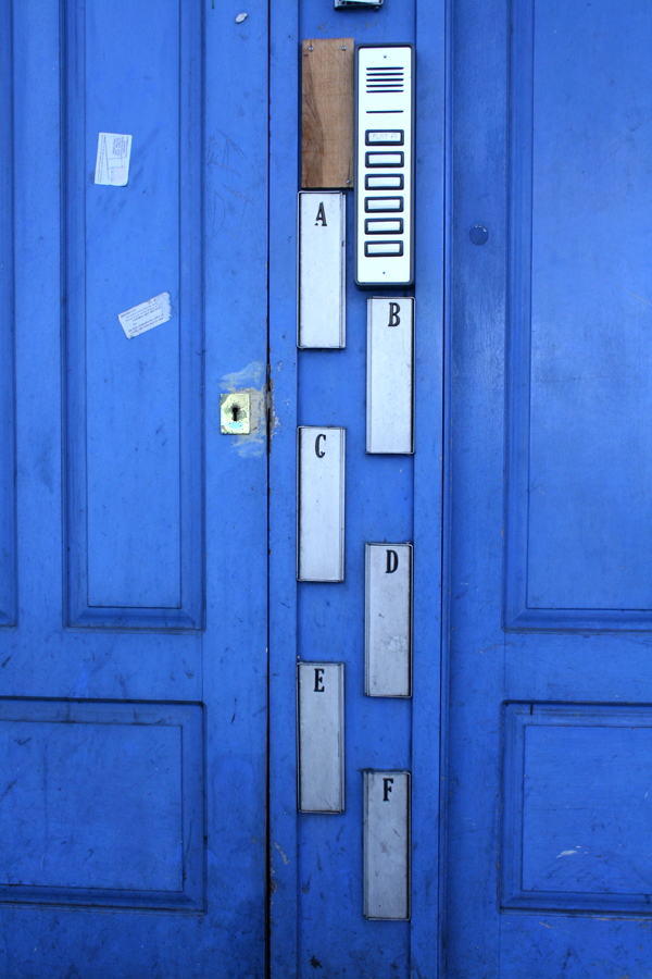
Deptford Door
Territories Map
This is the map i created for my map of my project so far. It is pretty much a glorieifed spider diagram- 25 words which can be linked most ways and any random 5 would create an interesting relationship and project. The map is firstly an illustration of my territory- this is the words. On the other side are various shapes of various sizes. The tool part of it starts when the viewer is asked to pick a set of 5 cards- do they pick all the cards of a certain shape, all the cards of a certain size ones, or the diagonals, the most aesthetic pattern or randomly. These choices then corespond to the words on the reverse creating new groupings. (The words on the reverse are also ordered (by shape) into 5 categories Curation: labeling, criteria, rhyming objects, display.
Frames and Boundaries: gaps, proximity, storage, horizontal space
Accumulation: repetition, gathering, acquisition, copying
The Collector: sequential, completion, validation, context abstraction
The Artifact: taxidermy, scale and proportion, typologies, sets and groups, specimen
At the moment these are also functioning as chapter headings for my context report but im pretty sure ill need to hack these down to a more managable size.


