Data Granularity —

This went round the studio the other day: catswing.io


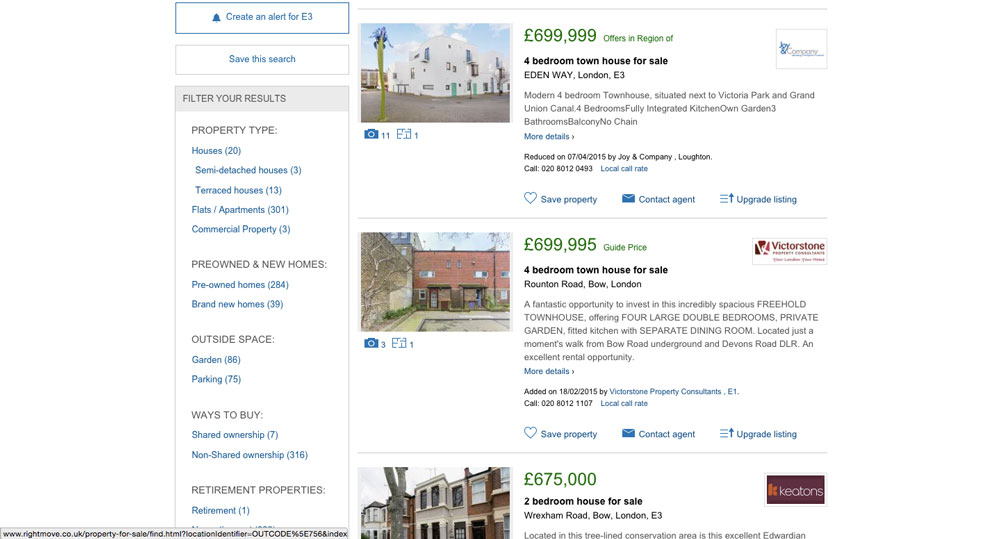
It brilliantly and simply shows how much space costs in London. It got me thinking about data granularity and how you could compare this map to Whereabouts London and also Rightmove


Each has more and more data and information about the various areas, and of course each has their place. But I wonder if there’s not enough clear information similar to Catswing for other issues or data heavy questions. What other problems could be better of more clearly explained? Sometimes all you need is the overview where someone’s done all the hard work for you.


Graphics I'm Loving at the Moment

Don't normally gratuitously post graphics (there's too much pretty stuff in the world). But here are a couple of particularly amazing bits of work- one from Artist and Illustrator Anne Harild who made these collages about the modernist housing estate Bryant Court in Hackney from photos of the area. I think it's the jeuxtposition of modernist building against the irregular shed-like quality of the 'dwellings' that gets me. So much lovely texture.

And this piece buy graphics legend Marian Bantjes speaks for itself- pointless and beautiful decoration of a laser dinghy, referencing another graphic design classic- dazzle ships.