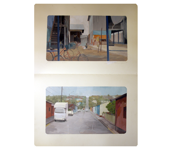
I went to the opening (and only!) night of a show my friend Tomomi Sayuda was involved with called Nixon Art Mosh. Only really one guys worked jumped out at me, this was the illustration work of Andrew Hem. He exhibited landscapes from moleskin sketchbooks. I particularly liked the way that the actual sketchbooks were framed rather than just the pages, and also the way the images where framed on the page was great. When you were looking at the work the fact that the sketchbook was there in front of you was very apparent and you got a real feeling of effort and worth form them- I was very aware a person had spent time making these images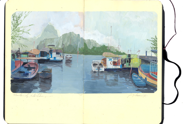
 .
.
Design Reseach Unit & Power in Consistency
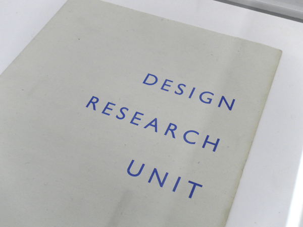
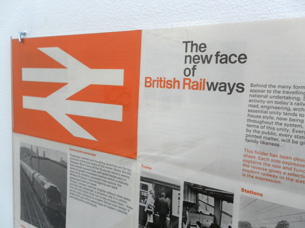
I went and saw the Design Research Unit (DRU) show over at Cubitt Gallery in Angel this weekend. I'd shamefully never heard of these guys but they were the original post/multi/trans disciplinary guys. Working over industrial, architectural, advertising and graphic design they were formed in 1943 (cheers Wikipedia). They have impeccably designed material which covers branding for the likes of ICI, Ilford and the legendary graphic system for British Railway. (Which always reminds me of Roundels equally legendary rebrand for Railfreight in the 80s). All of this belongs to a style of solid, accurate and robust design who's strength comes from not just the flawless work but also the consistency of it's application. The guidelines they lay down for the brands are exhaustive and particular and you get a real sense that the brands they created are successful through the rigour laid down by their creators. It is in contrast to the work of one of today's branding forces: Moving Brands. Their offer is based on their brands adapting to different situations and responding to it's audience. This is great for today's twittered up social networked scene but I don't know that it necessarily creates the same kind of well loved, iconic and long lasting work as the commanding and authoritarian brands from DRU. I suppose it has a lot to do with different times and approaches- DRU's work is not very sympathetic to the contexts it's applied to- it imposes itself but then as time passes it's audience grow up with it and it becomes more comfortable. With MB's work it is more immediate and welcoming but perhaps more transient- it will be interesting to see what from the brands created now will still survive and be as iconic 50 years on as British Rail. Perhaps the best name for a design practice ever:
The show is a traveling one and I loved the display which was on very functional and beautiful Dexion racking, mmm:
RCA Round up
Little bit late but here it is. Went to the RCA in short- was surprisingly disappointed with the Interactions work- I think now that most people can use an arduino a bit and appreciate that electronics and stuff isn't as hard as it used to be, the magic has left a bit. I'm not impressed now by a sensor or a projector with a something on it- I've seen it before- quite a bit. It all needs to be coupled with an intelligent and good idea which didn't seem as apparent as in previous years. I was surprisingly pleased with the Product stuff though- don't know why- perhaps because a fair bit of the interactions electronicy stuff has osmosised over- as I said- all that stuff is a lot more accessible than it used to be- the best piece of electronic interaction that was there was in the Design Products space. Whispering Leaves by Ji Long Shon. (and is that Charlotte on her website?)
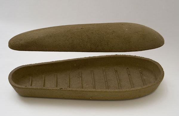
Earth Coffin by George Fereday looks like what it is- but a good idea mind.
Pressed Chair by Harry Thaler. Not often I like chairs- but this one seems to actually live up to it's eco concepts- I like that if you left it outside it might begin to look like a watering can. I think the raw metal one would look better with age- tricky to do.
Disappearing by Andrew Friend. Read the website and see the pictures. I like this one for a few reasons- the objects look like they are older than they are- the one for the sea looks like a 20 year old buoy. Also the project only comes alive in the photographs- the objects are almost by the by- the photos are the heroes here- contextualising the objects in wall sized photographs at the show was a winner- I've got a real thing at the moment for how far do you need to take a project before it's a project.
Camberwell Show
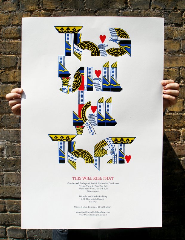
Honestly, I thought this show was in general crap. Graphic design had some great talent in it but was entirely let down by a crap exhibition style- one long table where everyone got one book or piece of printed matter to show- that's not graphics- it's boring after like five people. 3D Design...... just not good and as Lou said, "why do they get to show at the Tate and we don't?"- University of the Arts though innit.... Having said that i did really like the illsutration work and in particular Simon Memel's stuff (which i've just hunted down but found posted on it's nice that- dammit) This poster for their external show is amazing- just love everything about it-
