Bombs —

These three links caught my attention as a group and I thought I’d share them here.


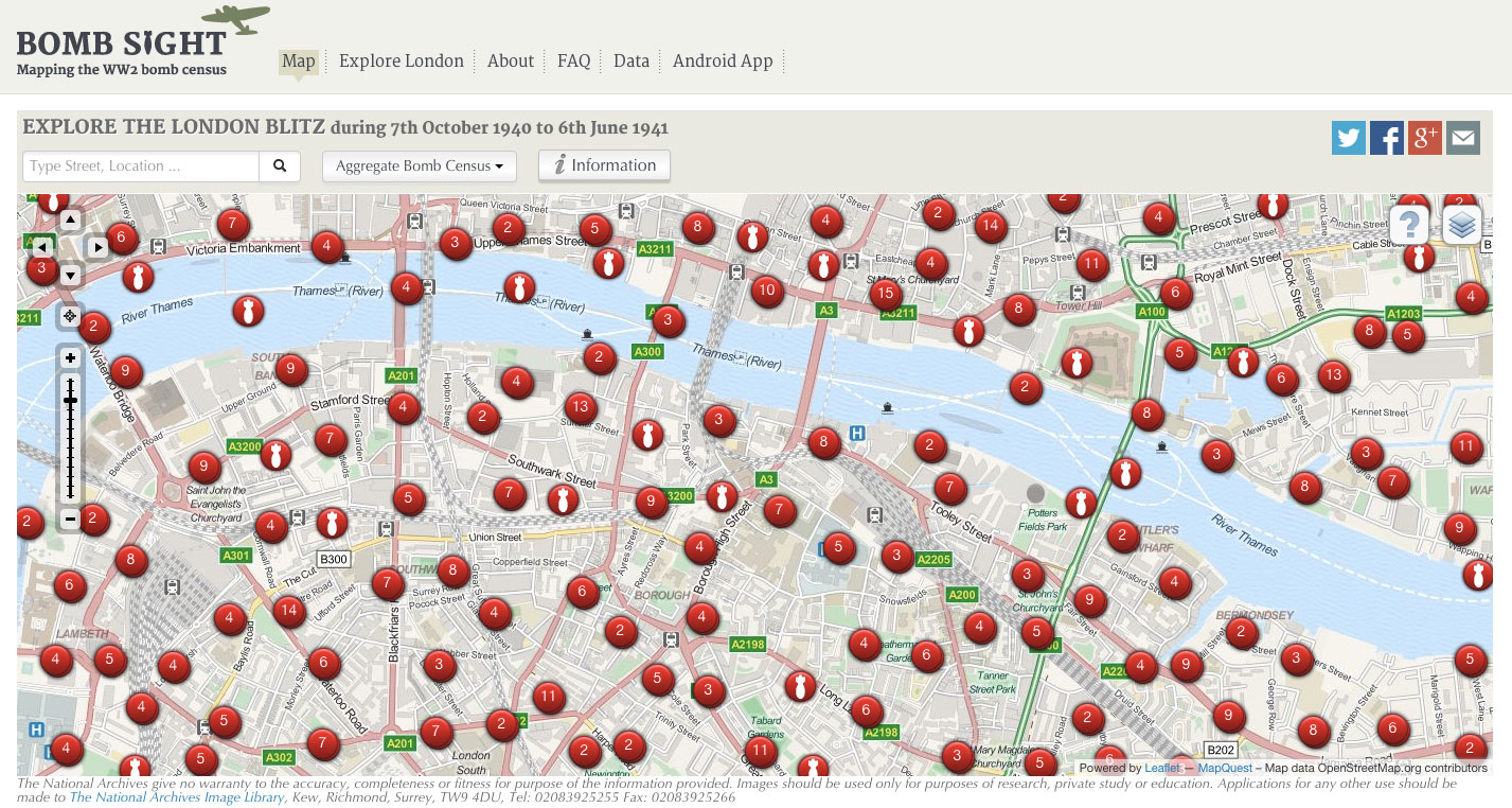
Bomb Sight uses archival data and modern mapping software to display where all the recorded bombs fell on London during WW2. The delivery mechanism means people immediately search for the places and areas that they live, work and inhabit everyday. Being able to relate archival data to your life now is such a powerful way to connect with history and to understand the blitz’s impact.


Starfish sites where created away real bombing targets in the UK to try and draw attention and bombs from German raids.


Wartime factories on the west coast of America created elaborate set designs on top of their factories to disguise them as fields and suburban streets. 


Data Granularity —

This went round the studio the other day: catswing.io


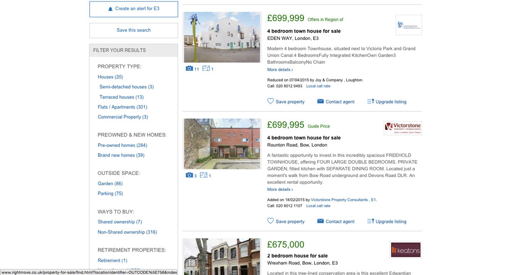
It brilliantly and simply shows how much space costs in London. It got me thinking about data granularity and how you could compare this map to Whereabouts London and also Rightmove


Each has more and more data and information about the various areas, and of course each has their place. But I wonder if there’s not enough clear information similar to Catswing for other issues or data heavy questions. What other problems could be better of more clearly explained? Sometimes all you need is the overview where someone’s done all the hard work for you.


Magnificent Obsessions: The Artist as Collector —

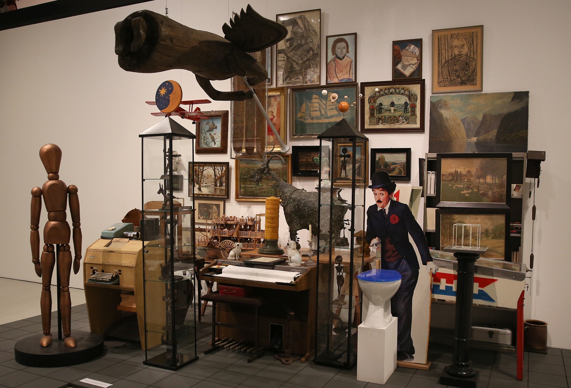
I went enthusiastically to the exhibition about collecting – those who know me well know that I like collecting, collections and collectors a lot. I did my final year project on it at university and it’s been a mild obsession ever since.

I was disappointed to find that this riotous, spectacular and curiosity inspiring subject had been presented in the most sterile way I’ve seen yet. Artists’ collections had been shown next to one example of their work, but in lots of cases it was a photography collection next to some photographs or a taxidermy collection next to some taxidermy. In this sense the exhibition did a very blunt job of drawing a line between the inspiration and the art it inspired, in most cases making the artworks look like bad copies of the collections.

The worst offender was the display of abstract painter Howard Hodgkin’s collection of Indian pictures. The pictures are small intricate paintings that have a strong use of colour. Outside the room was hung a piece of Hodgkin’s work, all big brush strokes and block colour. Yes, the use of colour was an obvious thread but other than that, this lone, decontextualised artwork, when hung next to the collection (of paintings!) seemed frankly inferior. Surely this is not the point of the exhibition? An exhibition which is dealing with both artist and collection should showcase each in it’s best light but this reduced both somehow.

The other aspect which was lacking was the critical angle about the politics of collecting itself. Whilst collections as artworks was tackled as a topic in the Martin Wong/Danh Vo piece, the idea of artists acquiring items as a whole collection, or from other collections was absent, as was the idea of ownership or authorship through collecting. In the case of Howard Hodgkin the fact that the pieces in his collection had been created as art, had then been collected and returned to object status, loaned to the Ashmolean Museum as ‘His’ collection and then displayed at the Barbican again seems to be a journey that could benefit from some curatorial scrutiny.

Of course all of these gripes are just that – an enthusiast rambling, and there were good bits. Showing all the packing cases that the collections and artworks had come in (albeit in a corner) was brilliant, and I liked the rugs which were liberally strewn around each area. 

(N.B. I’m sure some of these issues are at least touched on in the audio guide or the book, but I shouldn’t have to pay £40 to get a bit of thoughtful insight when I’ve already paid £12 to get in.)
 

Royal Mail & Online / Offline Communication —

This came through the other day. It’s a counterpoint to the GDS stuff I was talking about before. 

In this online world a mostly off-line (public) service knows it needs to get smarter, and the way it’s going to do this is with algorithms and digital systems. But it’s recognised that this more digital behaviour might effect some of it’s more off-line customers negatively. So they’ve communicated in the most relevant and appropriate medium what’s happening, why, and what it will mean for the end user. Good communication that’s all.

(I’ve realised here I think I’ve started mixing up off-line, non digital and human as the same thing. Weird)


Mike Bracken & GDS —

I watched this talk from Mike Bracken about the Government Digital Service. He talks about how the processes and practices the GDS encourages can help reshape how government is delivered in the increasingly digital future.

On the purely practical level I think the GDS can make the business of government (i.e. living and working) more up-to-date and more politically progressive. On a current affairs note it could also be a way to facilitate budget cuts that not only keep ‘front-line’ services the same but actually improve them.

But more than that, I’m interested in the way the GDS does this. Mike Bracken contrasts the iterative, responsive, adaptable and ‘fail fast, fail cheap’ approach of the GDS to a ‘big bang’ style favoured by policy makers. I’m becoming more aware that successful projects seem to have this modular structure built into them. It means they can be added to later (as needs or budgets develop), moved in a different directions and also contribute to a coherent whole.

It’s not just government or design projects this can apply to – in analysing the things I like about my garden it’s this ‘ahem’ organic way of allowing things to happen and within certain boundaries not being too fussy. Later on you can check on what’s happened in the system or framework and make decisions from there. If it’s good - encourage it, if it’s bad, stop it and try something else. This sort of plan also allows for serendipity and responds to actual conditions rather than sticking rigidly to the plan you set out at the beginning..

I think I’ve fairly comprehensively mixed my metaphors here but I’m sticking with it. Gardening is good, setting up systems is good, and working iteratively, with cycles of critique and reflection is good.


Neil MacGregor: Germany

Bronzefigur "Der Schwebende"

"Objects are better than text at conveying narrative" - Neil Macgregor

Last month I was lucky enough to attend the annual Angermion lecture at Queen Mary's College. The lectures are set up by the Anglo-german Centre there and this year saw Neil MacGregor (Director of the British Museum) give a fantastic talk about the upcoming show about Germany at the British Museum. The show will try to show the fragmentary nature of historical Germany, the tradition of technical and theoretical innovation and the effects of war all told through a series of objects.

It was like having a guided tour around the exhibition itself, my favourite objects where the Geld Not, paper money used in the inter-war years when inflation meant that low value coins where more valuable as a material than their token denomination. The really fascinating thing about this ephemera is not only how it describes a period in history but that the design and distribution of it was up to the discretion of individual territories. Germany has a lot more territories and dukedoms than Britain so there ended up being hundreds of different designs for the Geld Not reflecting different regions personalities and political, social and artistic preoccupations - some showing local historical figures, some showing craft, some showing modernism and some showing anti-semitic designs.

Another of the key exhibits in the show will be "Der Schwebende Engel" meaning 'The Floating Angel' by Ernst Barlach. A very special object and loan with so much history and and narrative imbued into it.

The exhibition will be run at the British Musuem from 16 October 2014 - 25 January 2015.


Jake and Dinos Chapman: Come and See

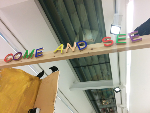
Come and See at the Serpentine Sackler Centre is showing from 29th November 2013 – 9th February 2014 This raucous exhibition of the Chapman Brothers work at the Serpentine Gallery is brilliant. Fun and violence crash together in detailed intricate pieces from the Hell landscapes up to the large mouse-trap-esque assemblages – all presided over by eerie and interested Klu Klux Klan inspired, smiley patch toting, socks and sandals wearing figures (presumably us, the visitor!).

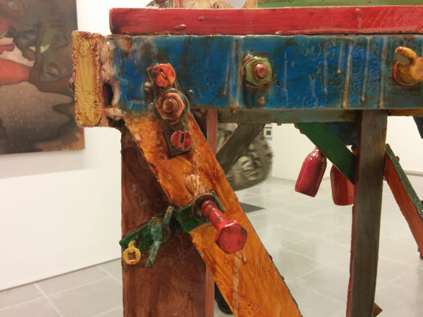
The apparent flippancy with which some of their materials are treated – gloss paint drips, rough cut plywood is left unsanded and items are hacked and screwed together in a seemingly uncaring way - is contrasted to the curatorial side in the artists. This side frames and hangs the crude sketches, labours over the tiny skeletons and micro-narratives in the hellscapes and gets haphazard combinations of objects made into presumably expensive and unwieldy bronzes, only to cover up the material with gloss paint and glue. Their work is comfortable in it's disregard for 'proper' process and finish quality and gains weight through it's scale, repetition and spectacle- the amount of work on show is invigorating. Whilst I don't think I'd be excited about living with a Chapman Brothers piece, I left feeling energised and wanting to make more stuff.