Videos
First up a lovely music video which my new studio chum Clara showed me, for The Mariners Children. The animation style is simple and genuine and kind of innocent, I really like it and can't put my finger on why- I think maybe it's the music video equivalent of a zine or something. Next up is a video showing the Tom Sachs studio rules. Beautifully done, funny and also some pretty solid rules. A nice insight into the workings of a great studio.
Photos October 2010
The Museum of Everything #3

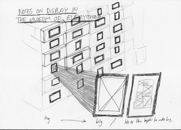 Me and my lovely girl popped over to the Museum of Everything over in Primrose Hill today. I had high hopes after last years first show which was brilliant (see old post here: post!).
The pictures above are a sticker you get on entry and a sketched version of, what for me was the most interesting hanging space in the whole show: a narrow corridor with breeze blocks hung with small frames holding small postcards. There were also large blow ups of some of the postcards (about a1 and bigger) which was a nice play on scale (a recurring theme), and also some large pieces made up of lots of small pieces (I know what I mean but maybe the picture will help if you don't).
Firstly, as I say, I had high expectations and one of the things I didn't like as much as last time was the use of the space and the route they took you on through it. I have vivid memories of being guided through a minor labyrinth of small spaces and corridors to come to an opening which gave onto the top of a set of stairs and an enormous double or triple height space, the walls of which were covered in work- proper salon style. The amazing feeling of unexpectedness was really special to me, this time we were guided another way through the space (which had been reconfigured slightly anyway) and that moment of awe wasn't as poignant as it had been in the first show. Also the contrast of small rooms and corridors to large spaces wasn't as apparent as it had been.
Having said that the show still threw up the strange 'grotto' like environments which characterised the last show. Shells adorning an entire room reflected the obsessive nature of the collector and the room with the homemade miniature fairground which was animated 4 times an hour intoxicated as you waited for it to come to life and then left you with a childish giddyness 2 minutes later as it died.
The weird lighting made the badly placed plaques really hard to read but fortunately most gave little added information to the work. There were a few that felt right. One story about a screen that Sir Peter Blake had bought told how he'd purchased it rather than a roomful of stamps. The story left you not regretting that he hadn't bought them but you did want to see them, and I suppose it was more that you were intrigued by Peter Blakes' character rather than anything else- what decisions informed his choices and also wondering at the opportunities that were presented to him- who else is offered the chance to purchase a room full of stamps. Fantastic.
The light however did give some dramatic shadows which were really great but unfortunately couldn't be documented due to the 'No Photography' rule. This would have been fine but there was no affordable catalogue or any exhibition view postcards. (As you can tell I'm more interested in the display, feel and curation of this exhibition which often isn't documented in the 'gift shop' at the end. I don't like organisers and institutions to govern the visual 'memories' I take from a place.)
Now onto some of the work shown. Walter Potter was a taxidermist and he made dioramas of scenes cast with stuffed animals. The interesting thing about his work (other than the 'freak' 2 headed lamb and 3 legged sheep he taxidermied), was the use of scale it employed. In one scene a doll's house was used in place of a real house, makes sense. But then a normal cat cannot inhabit the same world as the scaled down house. In it's place a kitten is used, and puppies and baby mice and an assortment of infant creatures who themselves are strangely proportioned when compared to their adult forms. Then there is a cockerel- and here Potter used carefully selected and positioned feathers from an actual cockerel on a small former. Likewise a cow, even in infancy, is not the correct scale for this scene and so calf skin is stretched expertly over a cow shaped frame to produce the correct effect. This range of skills, techniques and real and 'fake' creatures leads to a crazy scene of miniaturisation and freakishness. I'm reminded of a quote from Calum Storrie ('From Soane to Soane' in Inventory Vol 2, No. 2, edited by Neil Cummings (1997).)
"Each railway station, car, gun and doll's house shows us our world made small. Of course by juxtaposing different scales of object this world is made absurd. So what at first, appears as a way of simply relating to the world (especially the world of made things) is actually a mad tableau which defies coherence."
I also really enjoyed how personal and intimate the whole Museum feels, the hand crafted feel reflects the outsider/folk art which it exhibits. Here I should give a nod to This Is Studio, who created the branding and graphics for the show- lovely stuff. Link: thisisstudio.co.uk. There is no getting away from the humanness of the show. The Museum is very accessible and welcoming. The curio/ freak show aspect of the work shown arouses the voyeuristic tendencies in us and, as the introductory panel encourages you- it's about the experience of it as much as anything else. Certainly as you enjoy a cup of tea afterwards you feel like the tip through the varied rooms, corridors, spaces and types of work was similar to an hour and half tour through the human mind.
The Museum of Everything runs until Christmas in Primrose Hill. Link here. Map here.
Design Reseach Unit & Power in Consistency
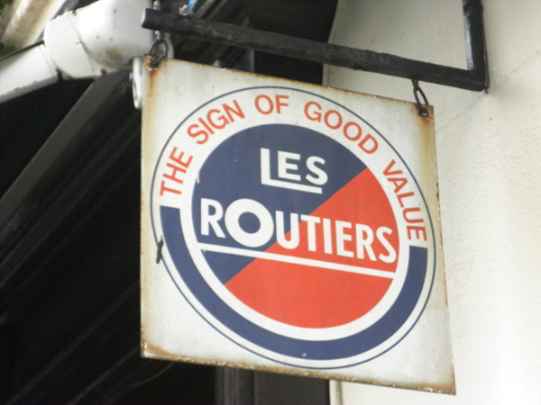
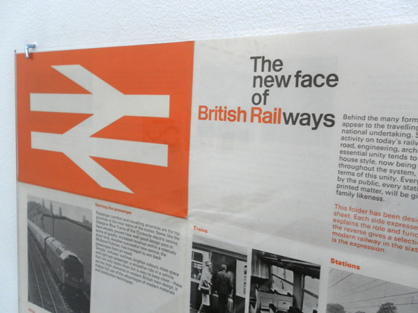
I went and saw the Design Research Unit (DRU) show over at Cubitt Gallery in Angel this weekend. I'd shamefully never heard of these guys but they were the original post/multi/trans disciplinary guys. Working over industrial, architectural, advertising and graphic design they were formed in 1943 (cheers Wikipedia). They have impeccably designed material which covers branding for the likes of ICI, Ilford and the legendary graphic system for British Railway. (Which always reminds me of Roundels equally legendary rebrand for Railfreight in the 80s). All of this belongs to a style of solid, accurate and robust design who's strength comes from not just the flawless work but also the consistency of it's application. The guidelines they lay down for the brands are exhaustive and particular and you get a real sense that the brands they created are successful through the rigour laid down by their creators. It is in contrast to the work of one of today's branding forces: Moving Brands. Their offer is based on their brands adapting to different situations and responding to it's audience. This is great for today's twittered up social networked scene but I don't know that it necessarily creates the same kind of well loved, iconic and long lasting work as the commanding and authoritarian brands from DRU. I suppose it has a lot to do with different times and approaches- DRU's work is not very sympathetic to the contexts it's applied to- it imposes itself but then as time passes it's audience grow up with it and it becomes more comfortable. With MB's work it is more immediate and welcoming but perhaps more transient- it will be interesting to see what from the brands created now will still survive and be as iconic 50 years on as British Rail. Perhaps the best name for a design practice ever:
The show is a traveling one and I loved the display which was on very functional and beautiful Dexion racking, mmm:
August 2010 Photos
Mitchell & Kenyon
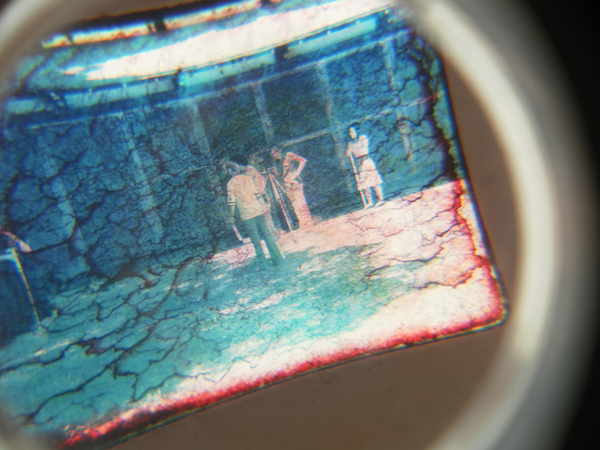
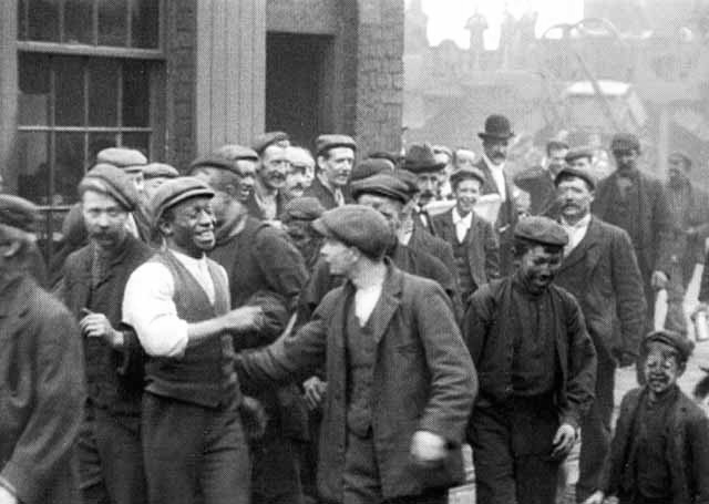
I was recently lent a great documentary film about Lancashire based film duo Mitchell and Kenyon. The pair were active in the early 1900s and shot Edwardian life to use as entertainment in the traveling shows. For example they would set up their camera to take footage of factory workers coming out of the gates at the end of the day- they would encourage people to get in shot and people smiled and waved and stuff and then the film would be shown the following evening as part of a nights entertainment and people would come and watch themselves on the screen.
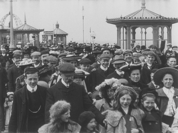
It's fascinating to historians as it provides a valuable insight into life then and specifically in and around the North West of the country. But I think it's more interesting when you start to consider spectacle and documentary and home video. It's also really interesting as when you see footage of these people from a hundred years ago (which normally you see as static photographs) you quickly understand what a short time ago it was and, we always consider people back then to be juddery (thanks to different frame rates on many cameras and stuff ) or stiff (as in the smart photographs) but when you see people moving around freely and normally (and I know it sounds stupid, but as you or I would) the anachronistic clothing and cars and stuff is forgotten a human connection emerges which I hadn't expected. You do get a real sense for the people in the images- smiling and being excited about this new technology. I wish I could have that novelty of being filmed and watching myself on screen in such an innocent way as they did. Sadly it will never be- I've grown up with cameras and video and the spectacle of cinema and the unreal on screen, not to mention the fact that any city dweller has to give into the fact that they are probably filmed 50 times a day (or whatever the scaremongers tell us).
A really interesting and worth watching artifact.
Trainers (& the way they are advertised)
I think it's interesting how Puma are advertising their product now. And as I had this queued up to blog I came across these other trainer adverts, trying to push their products in a similar 'not-so-sporty' way.

These trainers have built in foursquare- geotagging trainers- orwellian or brilliant?
