Food Politics —

From Michael Pollan: Cooking Matters on the Food Programme from June 2013

The decline in home cooking does parallel with women entering the workforce, [… since the 70s …] the food industry, who had been trying to insinuate itself into our households for a very long time – for about a hundred years, without too much success – recognised there was an opportunity here, and they stepped forward and said ‘We’ve got you covered, we’ll do the cooking. You don’t have to do it, and you don’t have to argue about it anymore’. The symbol of this for me is this amazing billboard that Kentucky Fried Chicken erected in the 70s with giant bucket of fried chicken, underneath a two word slogan ‘Women’s Liberation’. And they identified themselves with the aspirations of women, and they also redefined not cooking as a progressive thing to do. They found a tension and then relieved it. This isn’t to blame feminism for the collapse of home cooking, it’s to suggest that the industry used the rhetoric of feminism to get into the kitchen.
 

Representing Replicas — The Cast Courts —

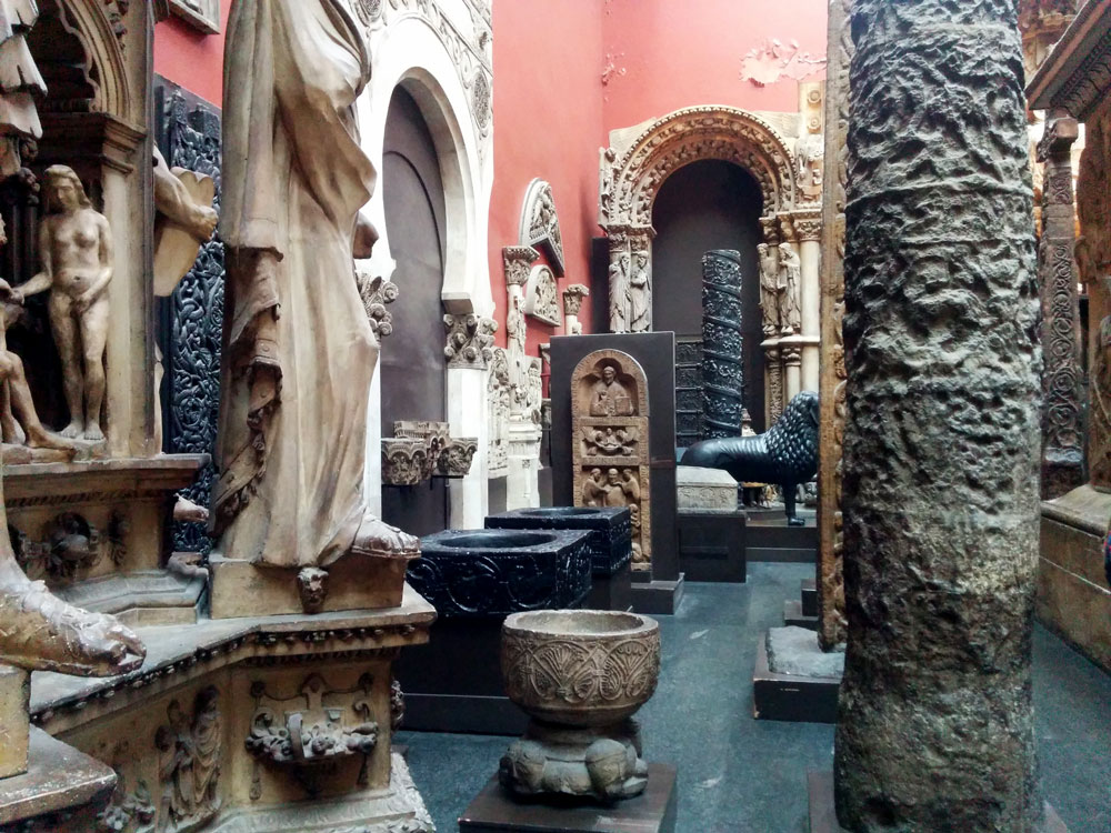
I was thrilled to discover the V&A Plaster Cast Courts for the first time recently. Tucked to the side of the museum, and away from the weekend crowds, the Courts house plaster copies of famous architecture and sculpture from across world. The scale of the rooms and the gigantic Trajan Column that dominates them is the first thing to be impressed by (even more so when you realise that they should be stacked on top of each other to achieve their original height). The spectacle of seeing such impressive architecture inside another building, framed and lit in the context of the museum is incredible. 


The sheer randomness of the collection is intoxicating. The courts have Frankenstein displays where the front of a cathedral from Santiago de Compostella has doors inset from Germany from 200 years earlier. Old mixes with new and everything from all over the world is together in one excessive architectural Disneyland. 


The really interesting thing around the casts is of course that they aren’t real. That is to say that they aren’t the original objects. They are facsimiles of much coveted masterpieces of art and architecture from throughout the ages. But the discussion around an objects authenticity and it’s subsequent relevance to scholarly or artistic study is only part of my fascination. In 2014, Room 46B was renovated, (the courts having originating in 1873), and it’s in this more modern world that this odd collection exists now. A modern museum setting that is constantly reassessing the usefulness and quality of facsimiles in all their forms – from digital print outs and online representations, to VR experiences and 3D-printed stand ins. What is and isn’t valid as an accessioned artefact seems to be as much up for grabs as ever. 

Here are some links about the history of the Cast Courts:
I never knew the V&A was originally the Museum of Manufactures! The History of the Courts. Room 46A. Room 46B.


Place, People, & Identity —

A few things that go together:

At the moment I’m on the look out for instances where people visually communicate where they’re from in bold and colourful ways. 


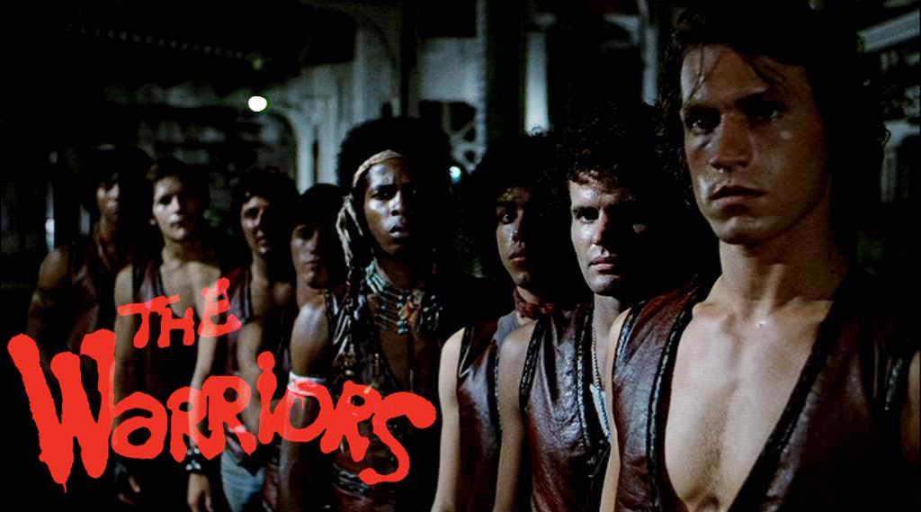
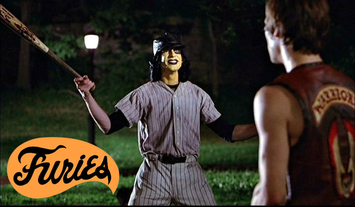
I first got interested in the film The Warriors as part of a workshop I was running, around the topic of urban spaces and identity. It’s an amazing film that sees a gang dislocated from their main Coney Island turf and subsequently fighting their way back through a series of rival gangs. Each group wears their back story on their sleeves, The Orphans wear rags and have razor blades whilst The Baseball Furies are a baseball gang with the fiercest face paint I’ve ever seen. Each member has an identity built from their gangs kit of parts (hair cuts, uniforms, weapons, patterns), this results in a sophisticated ‘same but different’ look amongst the members of each gang and the cumulative effect is both visually striking and laden with narrative.


I saw these Asafo flags in the Artist and Empire show at the Tate Britain. From what I can gather the Asafo Companies were and are a hierarchical people’s militia of the Akan societies of Ghana, with influence extending more broadly to act as social and political organisations. The areas colonial past can be read in the morphed Union Jacks in canton (meaning the upper left quadrant of the flag), each flag has a wide, patterned border, and each depict allegorical fight scenes. These flags become identifiers for the various Companies of Asafo. Their interest to me is in their variety within the constraints of the vernacular graphics.


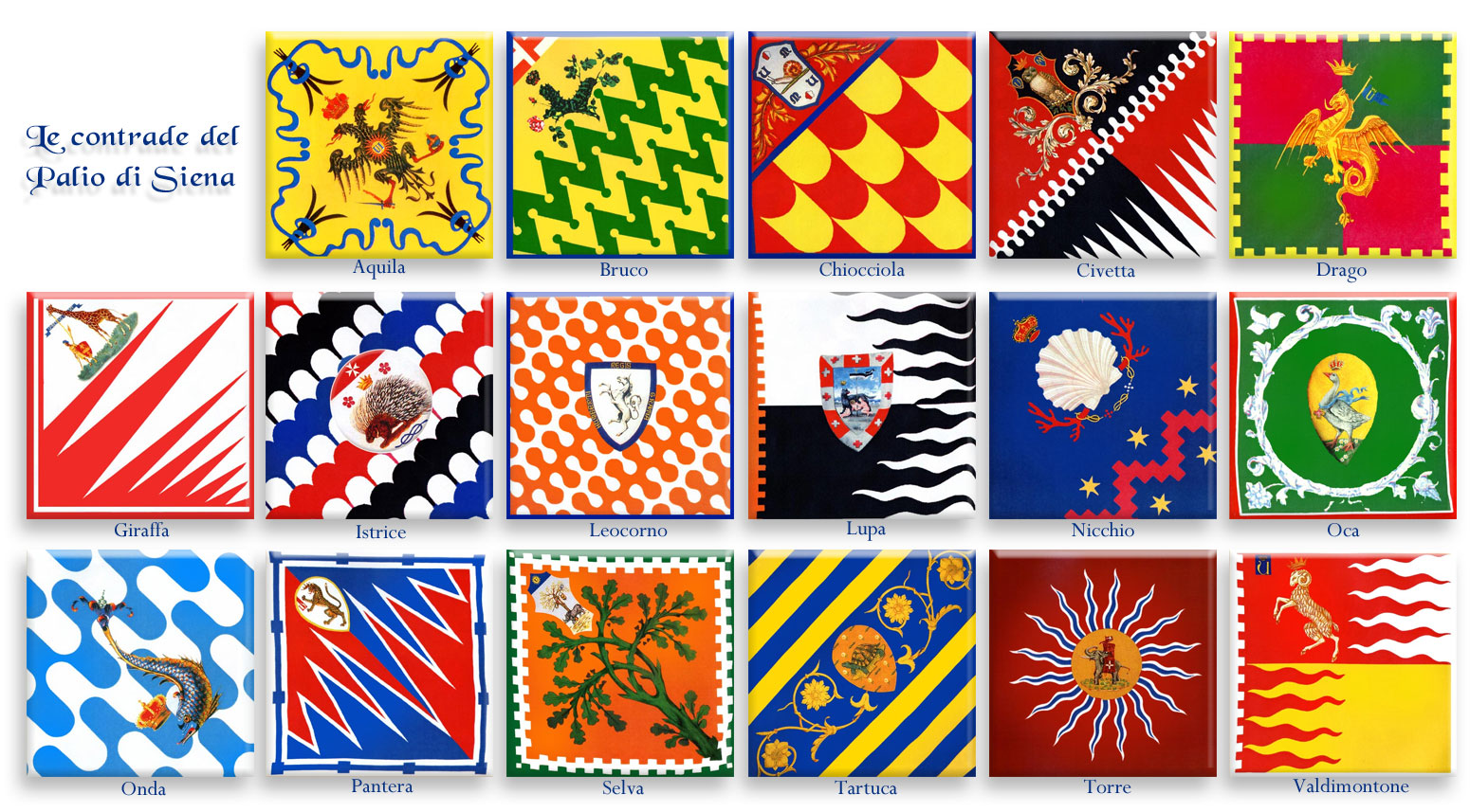
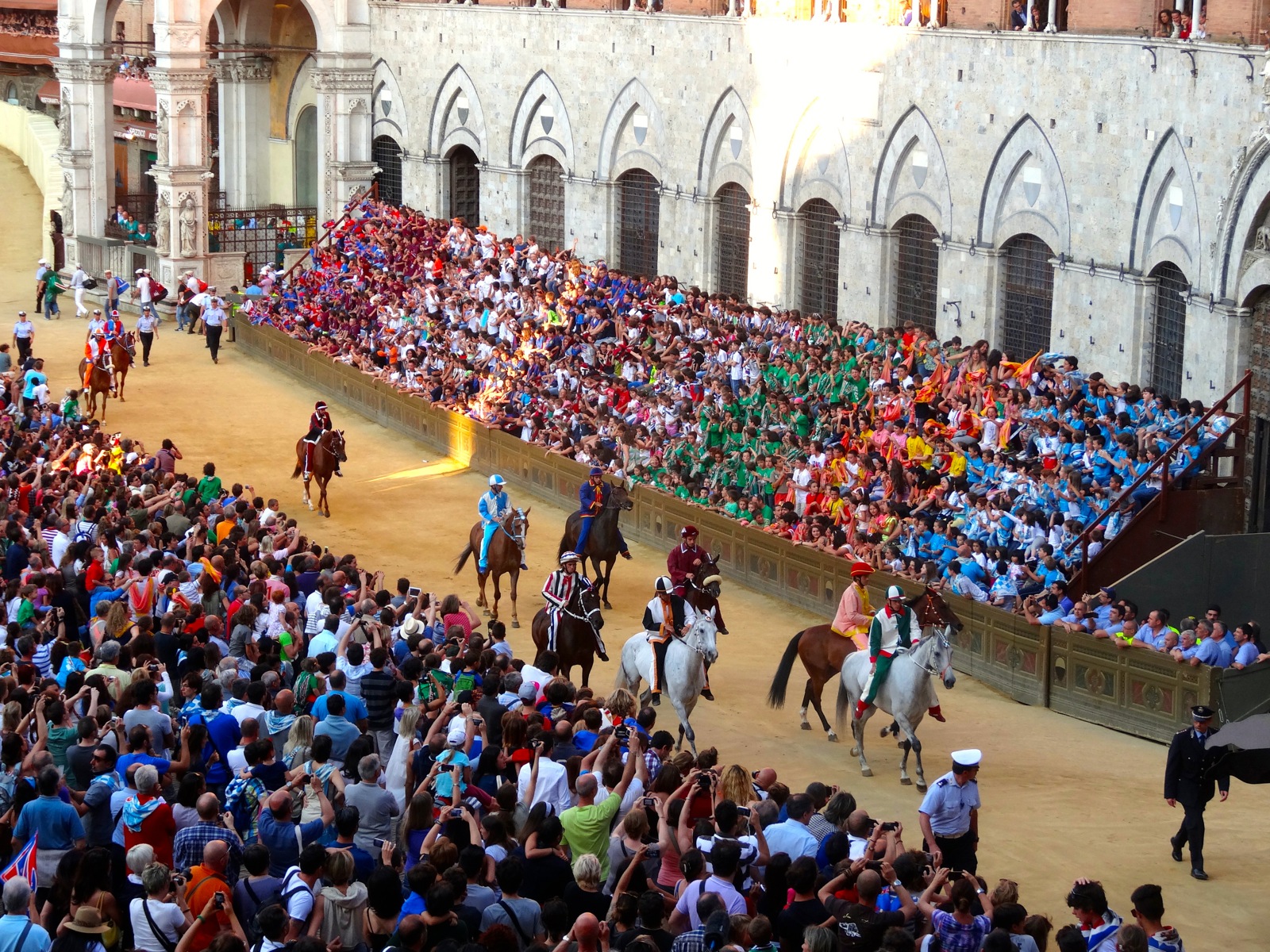
The Palio is a horse race in Siena. Characterised as violent, dangerous, and intensely political it’s been running twice a year since the 1600s. Spectators from ten city wards gather to watch their champion race for the glory of their part of town. The horses, riders, and spectators are covered in banners of the 17 various contrade colours. As Wikipedia says: “Each is named after an animal or symbol and each with its own long history and complicated set of heraldic and semi-mythological associations.”For example, Bruco means caterpillar and it’s residents were traditionally in the silk trade. The amazing thing here is the pride, fervour, and consistency with which each contrada’s colour is applied. I found it through this BBC programme: The Toughest Horse Race in the World: Palio


I want to make work on the internet while it’s still there — JODI —

I went to a talk at Goldsmiths by artists JODI. The piece of work that struck me most was the mobile game they developed called .ZYX. The game makes use of the sensors in the users phone, the accelerometer, the gyroscope etc. as interaction devices. In order to get to the next level, the player must for example spin around clockwise 10 times, or hold the phone still on top of their head for 2 minutes.


Alice Anderson at the Wellcome Collection —

Luke-Thompson_Alice-Anderson_01

Things wrapped in copper thread. It’s a deceptively simple artistic process but the result is stunning. Helped along by the fantastic lighting design the ideas of concealment, repetition, abstraction, scale, and familiarity changed as you walked through the space and the pieces caught the light differently – interactivity at it’s simplest and effective. The images here show the range of scales the work takes, ‘Geometries 64 Shapes’, a collection of small objects on a wall, and ‘Ropes’, a 250m long installation that you could get inside and walk around. 

 
Luke-Thompson_Alice-Anderson_02

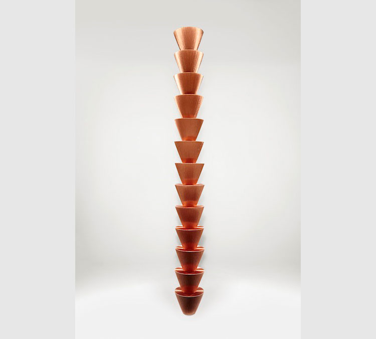
I really liked how the thread brought the objects back to a collection of simple shapes, with what looked like dull planes and then as you moved they shimmered with texture. The original objects were physically there but, like a palimpsest, were ghosted and built on top of when given their copper lustre. My favourite piece wasn’t on a postcard: ‘Jars’ from Anderson’s site is below. Wellcome Collection link here.