


Killer wedding present.
Bombs —
These three links caught my attention as a group and I thought I’d share them here.
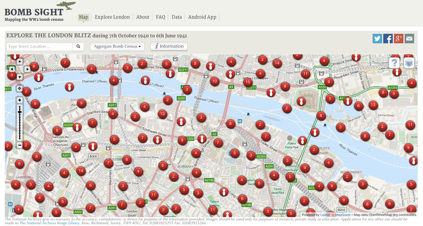
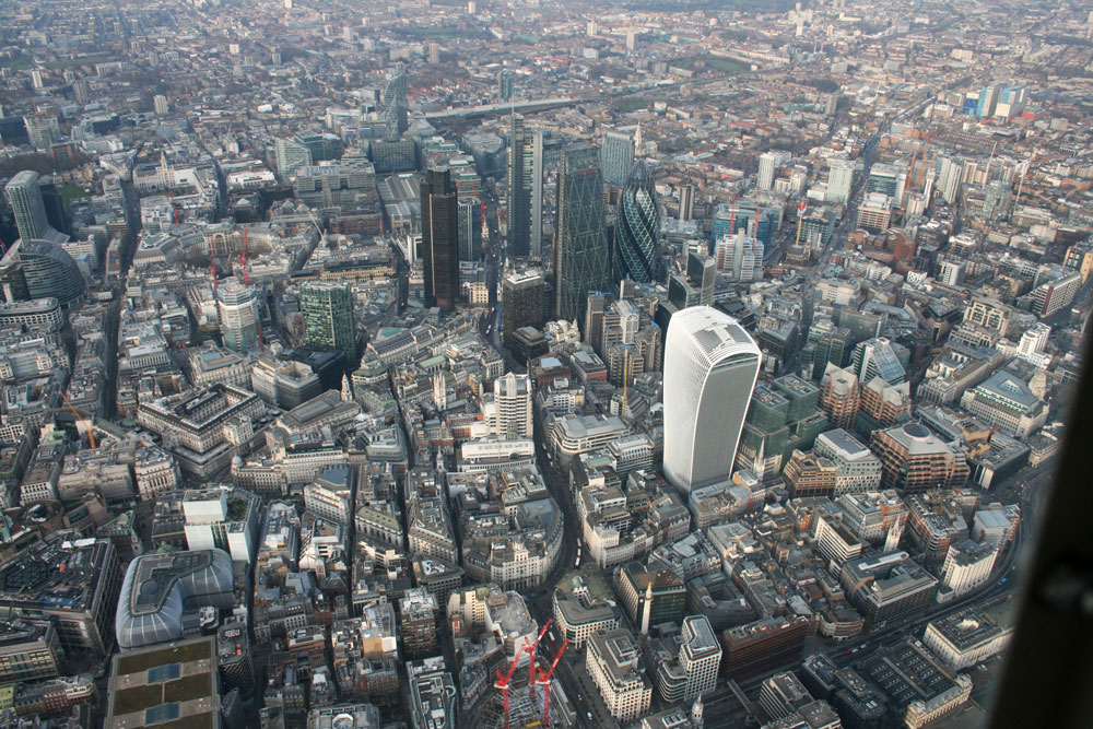
Bomb Sight uses archival data and modern mapping software to display where all the recorded bombs fell on London during WW2. The delivery mechanism means people immediately search for the places and areas that they live, work and inhabit everyday. Being able to relate archival data to your life now is such a powerful way to connect with history and to understand the blitz’s impact.

Starfish sites where created away real bombing targets in the UK to try and draw attention and bombs from German raids.

Wartime factories on the west coast of America created elaborate set designs on top of their factories to disguise them as fields and suburban streets.
Handmade: Slow TV —


Handmade is a series of three programmes from BBC Four that look at three master craftsmen and their processes. The key difference is that these programmes are slow. Very slow. As Director Ian Denyer explains: “The brief was brief: no words, no music, long, very long held shots I added my own restrictions – no shot less than ten seconds, and no movement of the camera.”
This makes for an unusual and absorbing hour and a half of TV. I find the pace, the craft, and the exclusive use of diegetic sound calming, cathartic and comforting. As someone who is something of a frustrated ‘maker’ I love watching people do what they’re good at. Seeing someone use a tool that they know so well that it’s a habit rather than a thought about action is thrilling and genuinely inspirational. (I get the same feeling of wanting to create things when I’m in Atlantis looking at sketchbooks and pens…)
Check all three out here.
The series blog is also worth a look for the voices of the craftspeople and an insight into how the series was made.
Data Granularity —
This went round the studio the other day: catswing.io

It brilliantly and simply shows how much space costs in London. It got me thinking about data granularity and how you could compare this map to Whereabouts London and also Rightmove.

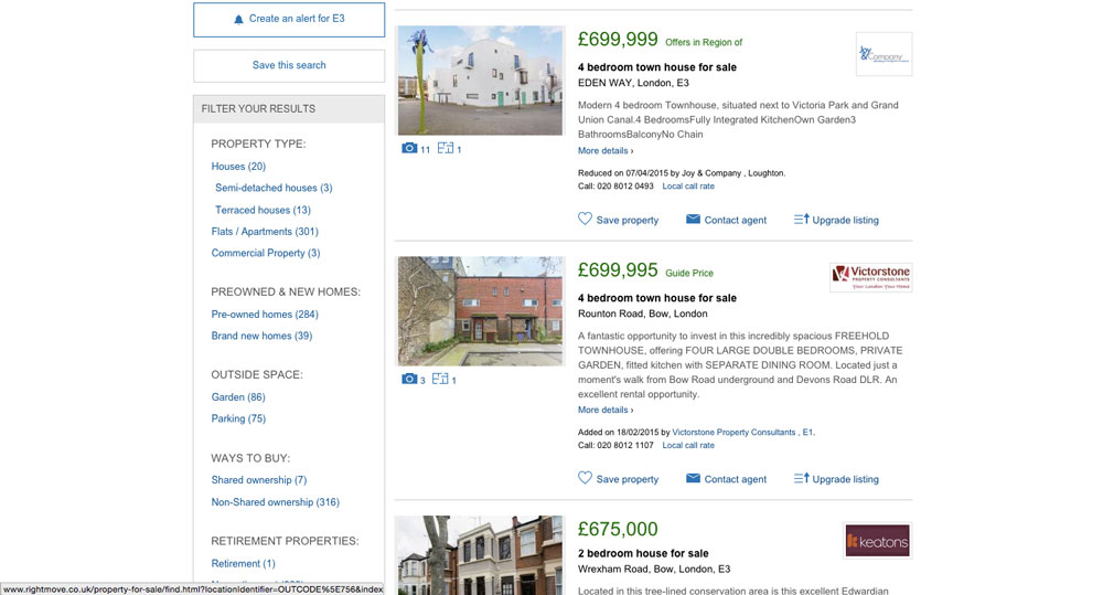
Each has more and more data and information about the various areas, and of course each has their place. But I wonder if there’s not enough clear information similar to Catswing for other issues or data heavy questions. What other problems could be better of more clearly explained? Sometimes all you need is the overview where someone’s done all the hard work for you.
December 2013 Photos


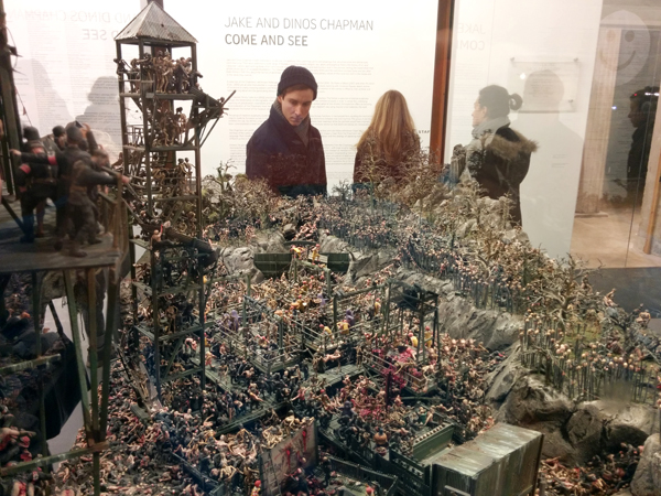
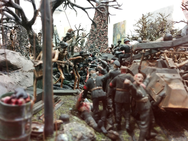
Jake and Dinos Chapman: Come and See
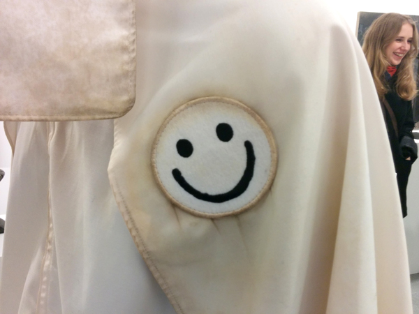
Come and See at the Serpentine Sackler Centre is showing from 29th November 2013 – 9th February 2014 This raucous exhibition of the Chapman Brothers work at the Serpentine Gallery is brilliant. Fun and violence crash together in detailed intricate pieces from the Hell landscapes up to the large mouse-trap-esque assemblages – all presided over by eerie and interested Klu Klux Klan inspired, smiley patch toting, socks and sandals wearing figures (presumably us, the visitor!).
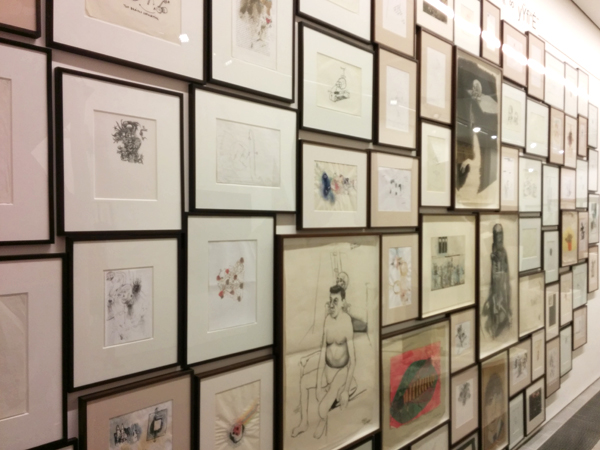
The apparent flippancy with which some of their materials are treated – gloss paint drips, rough cut plywood is left unsanded and items are hacked and screwed together in a seemingly uncaring way - is contrasted to the curatorial side in the artists. This side frames and hangs the crude sketches, labours over the tiny skeletons and micro-narratives in the hellscapes and gets haphazard combinations of objects made into presumably expensive and unwieldy bronzes, only to cover up the material with gloss paint and glue. Their work is comfortable in it's disregard for 'proper' process and finish quality and gains weight through it's scale, repetition and spectacle- the amount of work on show is invigorating. Whilst I don't think I'd be excited about living with a Chapman Brothers piece, I left feeling energised and wanting to make more stuff.